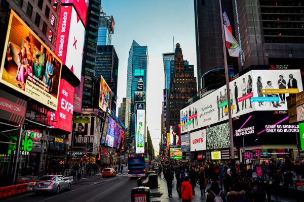
Imagine a bustling city, with people from all walks of life going about their day. They’re on the bus, in their cars, or walking down the street. Suddenly, they’re presented with a colourful and eye-catching advertisement on a billboard or bus stop. This is the power of Out-of-Home (OOH) advertising. It has the unique ability to reach a diverse audience in a very public and impactful way. With OOH, advertisers can target specific demographics and create a sense of urgency or immediacy that can drive consumers to take action. Whether it’s a billboard on a busy street or a bus shelter ad, OOH advertising is an incredibly effective way to build brand awareness and recall.
While OOH should not be limited to a billboard since there are a large plethora of solutions in its ambit in all shapes, sizes and forms.
Today we are going to focus on the grand old billboard and understand what is the role of a creative in delivering a successful campaign.
They need to see it first
Visibility is key, if your design is difficult to read or perceive visually the rest just doesn’t matter. This is where you need to understand what sort of a billboard you are designing for. What is the height, what is the distance from the location of the audience, what is the angle, how does the sun affect its visibility and so on.
While it may be tricky to design individually for a large cross country campaign. But work with your operations and assort properties on broader ranges. I promise you, you will end up with not more than 4 to 5 adaptations.
The further points I am sharing assume that media buyers have done their part in selecting properties that have a clear line of sight, good placement and ample lighting.
Operations need to ensure that the print quality and media is of a superior quality to get good output visually.
Font size has to be readable, to deliver legibility you can use a simple rule of thumb, for every 10 feet of viewing distance, your font size should be at least 1 inch (or 72 pt.) tall.
Remember it is a billboard
ROI calculation basis treatment of billboard as a piece of real estate is where the real loss takes place.
Too much information is shovelled on the canvas and a passing audience fails to register anything. Less is more should never be ignored in the case of a billboard.
Try to reduce to the most basic elements following the adage of quality over quantity and you will find success.
Planning
Before you jump the gun and get to the designing, it is good to spend time on the planning board, what is meant to be achieved through the billboard for instance are you trying to –
- Create more brand awareness
- Generate a call to action
- Educate your viewers
- Advertise a new product line
Create with a purpose in mind and let that purpose guide you throughout the creative process.
Get to know your audience
Understanding the audience makes the process easy. Know the language they speak and the aspiration they carry. Create for real people and not data sets. It is not about perfection rather building that warm emotional human connection.
Headlines
This will make or break your creativity. A billboard is its headline, this is your one and only chance to speak and speak briefly you must.
Good billboard headlines can be anything from being too direct to being humorous. Remember time is against you, your audience is on the move, short simple words are what you need to deliver with.
If there was only one thing that I could share to improve headlines, it would be context. With context in mind you can tell stories and show a bigger picture with one line.
Look at Amul butter they comment on an entire event with one headline, this is the power of context.
Hero Image
If there is anything more important than the headline it is the image, the headline will ensure action from the audience, the image will ensure that the audience reads your headline.
Why because it takes far less time for the human brain to process an image compared to reading text and making sense of it. The human brain processes images 60,000 times faster compared to text.
Get the image right and you will have your text read.
So here the 7 things you need to consider to get the image right:
- Visibility: The image should be clear and easy to see from a distance.
- Contrast: The image should have a high contrast ratio to make it stand out against the background.
- Simplicity: The image should be simple and easy to understand, with a clear message.
- Size: The image should be designed to fit the size of the billboard.
- Audience: The image should be appropriate for the target audience and likely to appeal to them.
- Branding: The image should be consistent with the company’s branding and messaging.
- Location: The image should be appropriate for the location of the billboard, taking into account factors such as lighting and traffic flow.